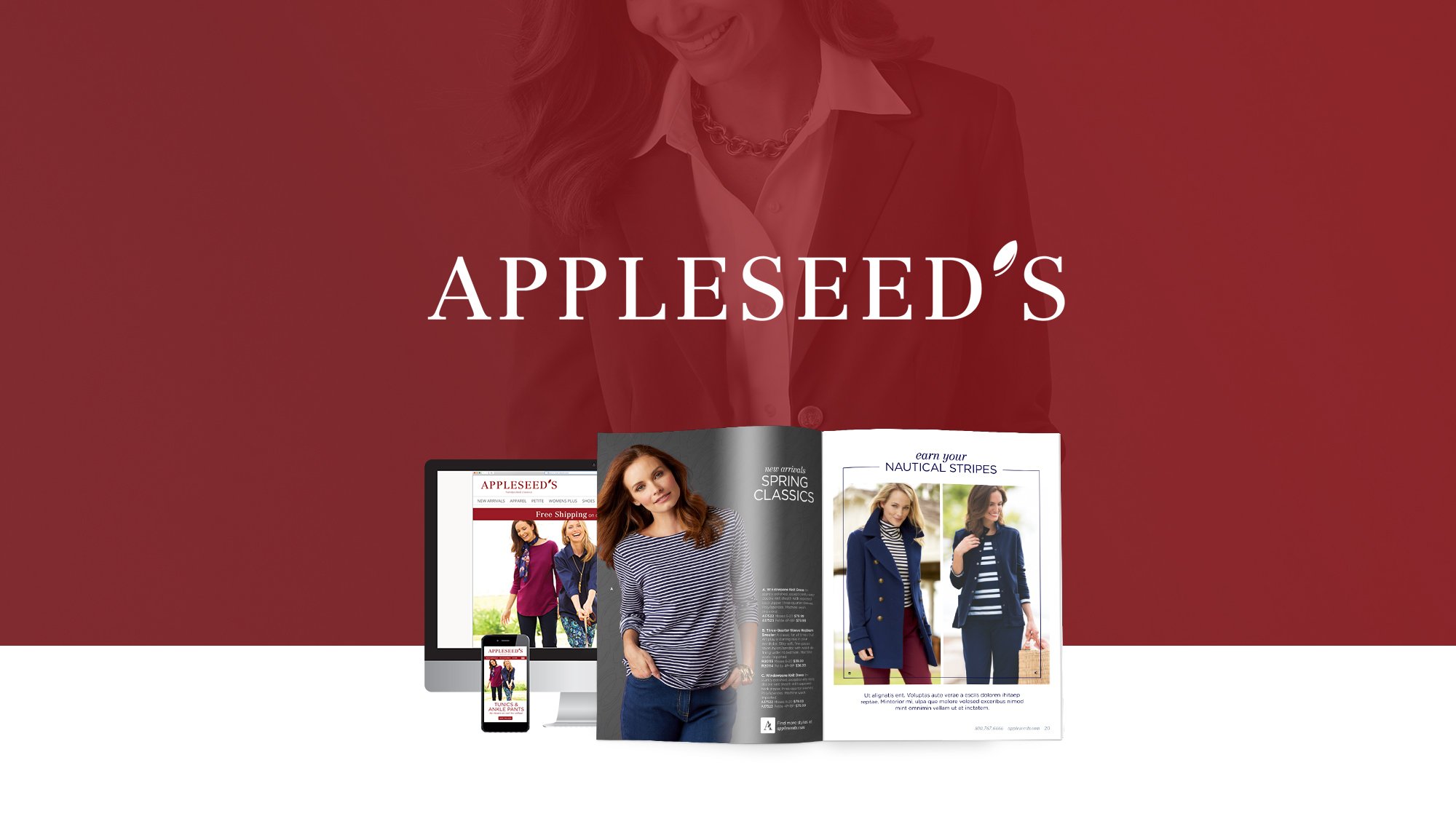
About Appleseeds:
Appleseeds is a heritage women's fashion brand with a focus on timeless style, comfort, and quality for mature consumers. With deep catalog roots and a loyal customer base, the brand needed a visual refresh to better reflect the evolving expectations of its shoppers while honoring its classic heritage. The goal was to retain brand equity but elevate the brand into a more aspirational, cohesive, and contemporary space.

Role: Senior Art Director
Scope: Brand identity refresh including logo, typography, color palette, photography style, visual guidelines, and brand rollout across catalog and digital assets
Tools: Adobe Illustrator, InDesign, Photoshop, XD
Process: Brand audit, stakeholder interviews, visual research and moodboarding, identity development, design system creation, implementation support
The Opportunity:
Appleseeds’ visual identity no longer resonated with modern consumers or reflected the quality of its products. The brand lacked a consistent design system, and its catalog and digital materials felt disjointed and outdated. The challenge was to strategically evolve the brand’s visual presence without alienating its loyal customer base—positioning it as timeless, elevated, classic, and current.
Key Goals:
Refresh the logo and brand elements to feel more refined and premium
Create a unified visual language to be used across print and digital
Build a scalable system for efficient production, layout consistency, and storytelling
The Approach:
Brand Audit
Reviewing competitor visuals in the lifestyle/apparel space
Conducting internal stakeholder interviews to understand perception gaps
Evaluating existing touchpoints (catalog covers, page layouts, digital ads)
Modernized Visual Strategy
Refined logo for elegance and legibility
Color palette and type pairings for a clean, classic, and modern brand
Lifestyle & product photography to reflect the confidence and authenticity of the Appleseeds customer
Design Systems
Designed flexible templates for catalog layouts
Created brand guidelines and component libraries for ongoing use by in-house teams and vendors
The Execution:

The Results:
The final visual identity transformed Appleseeds into a more aspirational brand while staying true to its roots.
The Refreshed Brand:
Consistent and elevated look across channels
Scalable templates and clearer systems reduce layout timeframes
Shared visual language improved cross-channel presentation
Impactful storytelling and product engagement supporting the brand promise


